

Product elements
Whenever we present our platform we seek to balance the platform elements with real-world elements. This surfaces in our use of images and human elements, which we explore on this page.
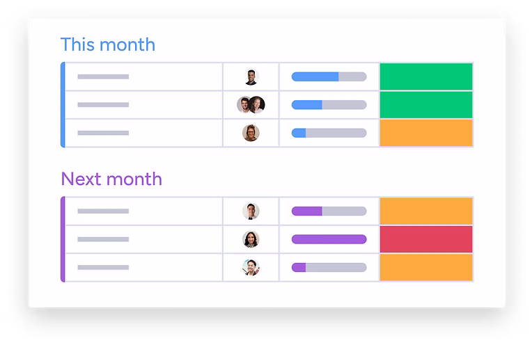
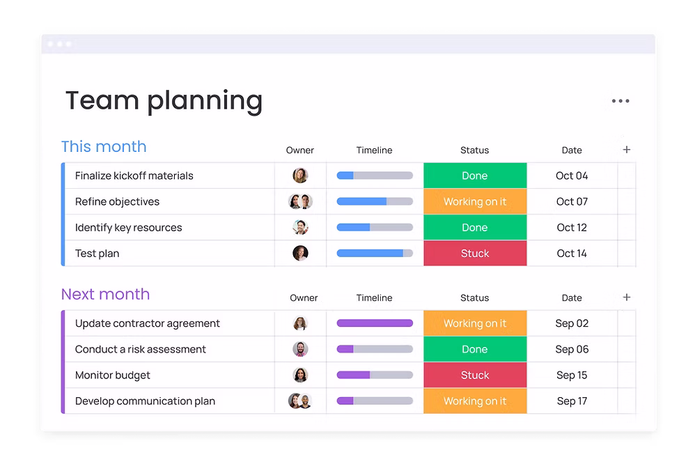
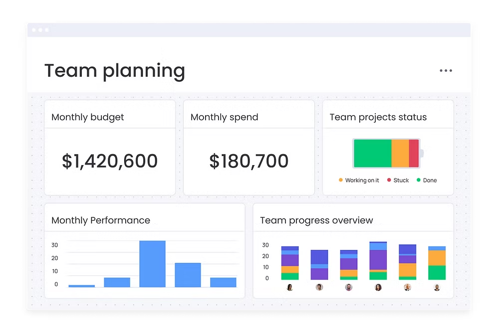
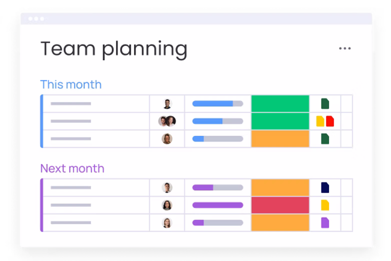
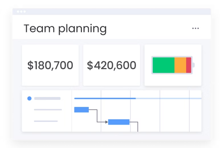
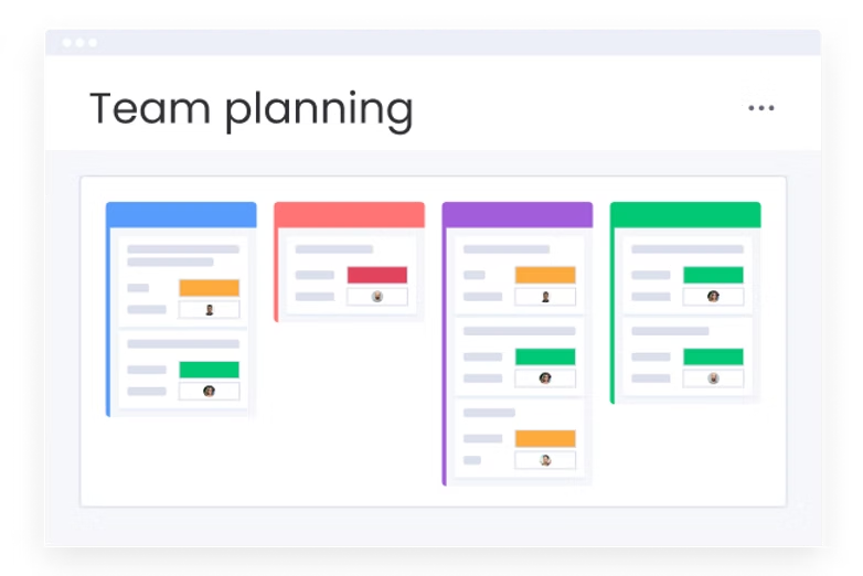
When creating boards for landing pages, or other assets, it is crucial that the board reflects the real look and feel of our product.
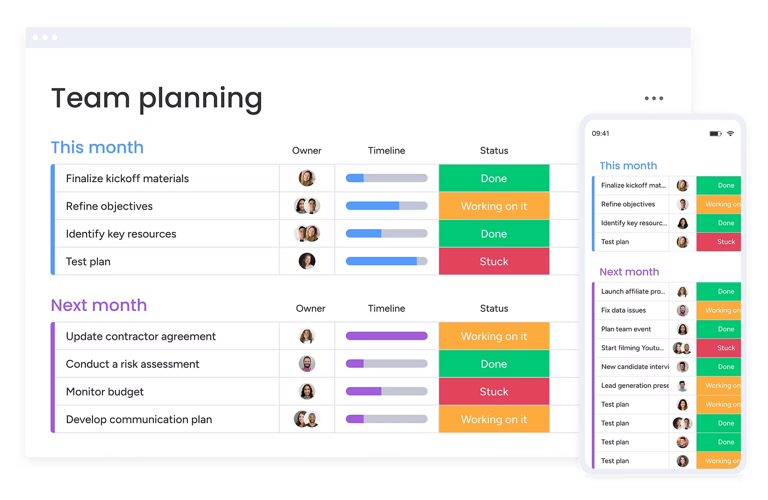
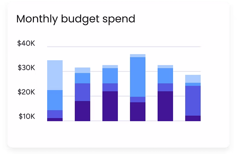
We show real boards with real content. We don't use real screen-shots since usually they are too complex. For marketing, we use "marketing boards" that were cleaned and created for marketing purposes or "tiny boards" for small assets.

No real devices or mockups.
Real devices will only appear as a part of a photographed scene.

We only use the general shape of a device, we want to avoid specificity and old device versions.
Our product is visual and fun. In marketing, we don't use complex real screenshots. We usually use designed board templates.
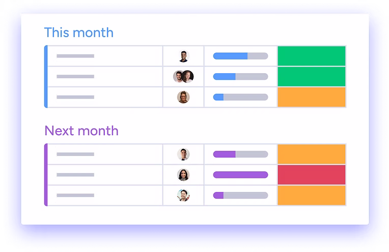
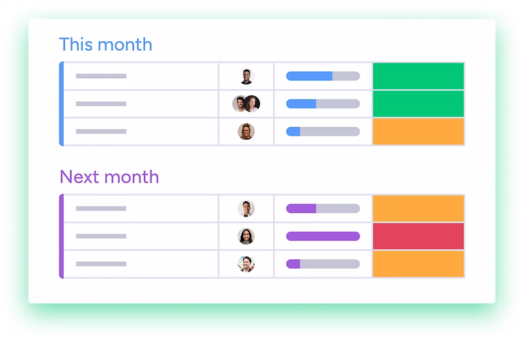
To emphasis the digital enviroment, we always show browser or mobile border (in 40% opacity)
Building block cannot be placed without shade underneath.
To indicate the place of the board, we add a browser on the top part of the phone (e.g. hour, internet, or battery)
Marketing boards are what we use to represent our platform.

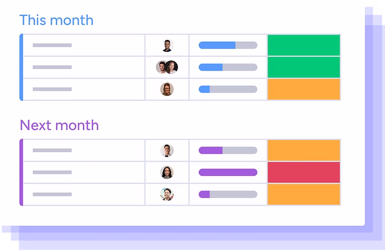
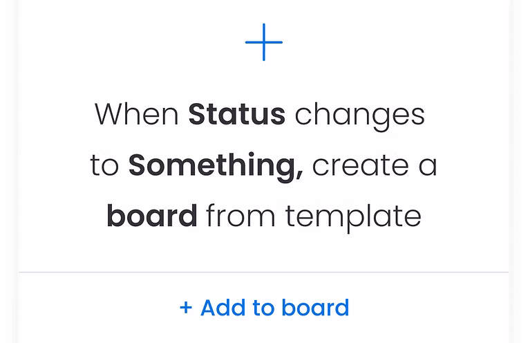
When the asset size is under 300 px we use a Tiny board. Tiny boards are iconic boards with graphic elements to represent real platform parts. No real text is included.
When the asset size is under 300 px we use a Tiny board. Tiny boards are iconic boards with graphic elements to represent real platform parts. No real text is included.
The effects are used to pop out product elements and should not be used for buttons, shapes, text, etc.